Search
A search interface with faceted filtering. Contains a child listing block for results and typed facets (checkbox, select, date range, toggle) for filtering.
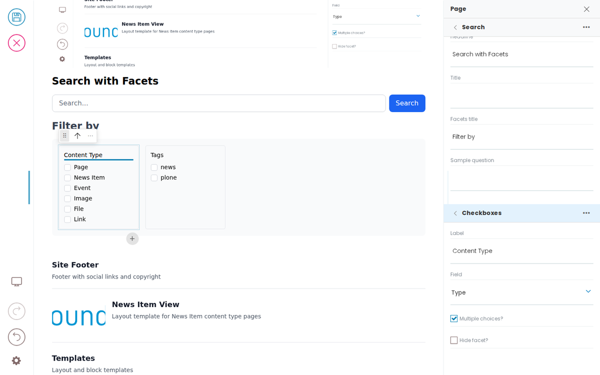
Search with Facets
Filter by
Docs
A design-system-first page-builder toolkit for any CMS. Guides for building a frontend, deploying and securing Inka, editing content, testing, adapters, and rules.
Templates
Layout and block templates
CMS adapter guide
Connect Inka to a content store through one adapter contract — the same experience for editors whatever sits behind it.
How Inka Works
Inka is the page-building and governance layer between your CMS and your front ends. Content stays in the CMS, rules come from your design system, and front ends in any framework render the result. Editing is private; publishing is public.
Rules and checks
The rules your front end sets are applied while people edit, from blocked saves to advice beside a field. Inka Assure, in development, will keep the record of what was checked and signed off.
Deploy and secure Inka
What to run, where to put it on your network, how editors' logins reach the front end, and the settings that keep editing private.
Simple Search
Features
What Inka gives editors, compliance teams, developers and IT. A page builder that works on the real page and keeps to your design system, over the CMS you already run.
Plugins
Extend Inka: connect it to your content stores, and add capabilities such as Inka Assure.
Pricing
Inka is free and open source. PretaGov offers managed hosting, Inka Assure, a security and maintenance subscription, and services, all quoted. Nothing is priced per editor.
Search
Search the site
Examples
Example blocks to spark ideas. Inka ships as a blank slate — these are things you can build with your own components, not a fixed library.
Images
Documentation screenshots referenced by editor-experience pages.
Developer Reference
Schema
Pass this object inside the blocks option when calling initBridge() to register this block type with the admin UI. See Custom Blocks for the full setup guide.
    search: {
        id: 'search',
        title: 'Search',
        group: 'common',
        blockSchema: {
            properties: {
                variation: { title: 'Variation' },
                query: { title: 'Query', widget: 'querystring' },
                listingBodyTemplate: { title: 'Results template' },
                showSearchInput: { title: 'Show search input', type: 'boolean' },
                showSortOn: { title: 'Show sort on', type: 'boolean' },
                showTotalResults: { title: 'Show total results', type: 'boolean' },
                sortOnOptions: { title: 'Sort on options', type: 'array' },
                facets: {
                  // Typed sub-items: each facet's `type` names its own block type,
                  // so the item is edited with THAT type's schema (the same shape
                  // slider.slides uses). A site can register another facet type and
                  // list it here without touching this schema.
                  title: 'Facets',
                  widget: 'object_list',
                  typeField: 'type',
                  allowedBlocks: ['checkboxFacet', 'selectFacet', 'daterangeFacet', 'toggleFacet'],
                  defaultBlockType: 'checkboxFacet',
                },
                headline: { title: 'Headline', type: 'string' },
                title: { title: 'Title', type: 'string' },
                facetsTitle: { title: 'Facets title', type: 'string' },
                // The quick-answer region only renders once a query has been
                // asked; the sample question is what data-block-selector-input
                // types to reveal it (query-reveal-page + query-reveal.spec).
                quickAnswerSample: { title: 'Sample question', type: 'string' },
                quickAnswer: {
                  title: 'Quick answer',
                  widget: 'blocks_layout',
                  allowedBlocks: ['quickAnswer'],
                },
                // The results region (docs/examples/search.md): a child listing
                // block under blocks_layout.listing. Undeclared, its children
                // render but never enter the pathMap — the exact orphan the
                // guardrail now refuses without exemptions. Mirrors the admin's
                // search schemaEnhancer (volto-hydra/src/index.js) EXACTLY —
                // that enhancer only adds the field when absent, so a diverging
                // fixture copy would win and change the sidebar.
                listing: {
                  title: 'Results Listing',
                  widget: 'blocks_layout',
                  description: 'Listing block to render search results',
                  allowedBlocks: ['listing', 'default', 'summary', 'teaser', 'image'],
                  maxLength: 1,
                  defaultBlockType: 'listing',
                },
            },
        },
    }
JSON Block Data
Example block JSON (as stored in the CMS). This is the data structure your component will receive in the block prop.
{
  "@type": "search",
  "headline": "Search with Facets",
  "listingBodyTemplate": "summary",
  "facetsTitle": "Filter by",
  "facets": [
    {
      "@id": "facet-type",
      "type": "checkboxFacet",
      "title": "Content Type",
      "field": {
        "value": "portal_type",
        "label": "Type"
      },
      "multiple": true,
      "hidden": false
    },
    {
      "@id": "facet-subject",
      "type": "checkboxFacet",
      "title": "Tags",
      "field": {
        "value": "Subject",
        "label": "Tags"
      },
      "multiple": true,
      "hidden": false
    }
  ],
  "blocks": {
    "listing-1": {
      "@type": "listing",
      "variation": "summary",
      "querystring": {
        "query": [
          {
            "i": "path",
            "o": "plone.app.querystring.operation.string.absolutePath",
            "v": "/"
          }
        ],
        "sort_on": "effective",
        "sort_order": "descending"
      }
    }
  },
  "blocks_layout": {
    "listing": [
      "listing-1"
    ]
  },
  "query": {
    "b_size": "4",
    "query": [
      {
        "i": "path",
        "o": "plone.app.querystring.operation.string.absolutePath",
        "v": "/"
      }
    ],
    "sort_on": "effective",
    "sort_order": "descending"
  },
  "showSearchInput": true,
  "showSortOn": true,
  "showTotalResults": true
}
Rendering
How this block renders in your frontend. Add its handling to your renderer, or — for list-style blocks — register a fetcher and reuse your list rendering.
function SearchBlock({ block, blockId }) {
  const [query, setQuery] = useState('');

  const facets = (block.facets || []).filter(f => !f.hidden);
  const listing = block.blocks_layout?.listing || [];
  const listingId = listing[0];
  const listingBlock = listingId ? (block.blocks?.[listingId]) : null;

  return (
    <div data-block-uid={blockId} className="search-block">
      {block.headline && <h2 data-edit-text="headline">{block.headline}</h2>}
      <input
        type="search"
        placeholder="Search..."
        value={query}
        onChange={e => setQuery(e.target.value)}
      />

      {facets.length > 0 && (
        <div className="facets">
          <h4 data-edit-text="facetsTitle">{block.facetsTitle || 'Filter'}</h4>
          {facets.map(facet => (
            <FacetRenderer key={facet['@id']} facet={facet} />
          ))}
        </div>
      )}

      {listingBlock && (
        <ListingBlock block={listingBlock} blockId={listingId} />
      )}
    </div>
  );
}

function FacetRenderer({ facet }) {
  switch (facet.type) {
    case 'checkboxFacet':
      return <fieldset data-block-uid={facet['@id']}><legend data-edit-text="title">{facet.title}</legend>{/* checkbox options */}</fieldset>;
    case 'selectFacet':
      return <label data-block-uid={facet['@id']}><span data-edit-text="title">{facet.title}</span><select>{/* options */}</select></label>;
    case 'daterangeFacet':
      return <label data-block-uid={facet['@id']}><span data-edit-text="title">{facet.title}</span><input type="date" /> – <input type="date" /></label>;
    case 'toggleFacet':
      return <label data-block-uid={facet['@id']}><input type="checkbox" /> <span data-edit-text="title">{facet.title}</span></label>;
    default:
      return null;
  }
}