Docs
A design-system-first page-builder toolkit. Strike the right balance for your site — make it easy for editors to create engagement while staying compliant.
Why Inka?
- Compliance and engagement, not a trade-off — you decide where the dial sits for each site, instead of choosing between locking editors down and letting the design system drift
- Design-system-first — components declare what they tolerate, so off-system output can't be produced
- Multi frontend, multi backend — Next.js, Nuxt.js, Astro, plus server-only stacks (PHP, Django, Rails, Laravel) via the server-render pattern; switch channels mid-edit
- AI under the same constraints — everyone's AI can build you a page; ours can't build one that breaks your design system
- Evidence, not just warnings — rules a machine can't decide go to the people who can, and the determination is recorded against that version of the content
- Quick to adopt — enable visual editing with simple HTML data attributes, no React or Vue required in your frontend
- A toolkit, not a CMS — good out of the box with zero configuration, extensible when you need more; open source and self-hostable
- Enterprise features — versioning, i18n, workflow, and automated content rules
Try the online demo
The fastest way to feel what Inka does is to log into the hosted demo and edit a real page against a real frontend.
Open <https://hydra.pretagov.com>, log in, then:
- Open user preferences (bottom-left).
- Pick one of the preset frontends, or paste in your own frontend URL.
- Edit any page — every change updates the live preview.
The default preset is a Nuxt.js frontend deployed as an SSG to demonstrate scale-to-zero editing on free hosting. An Astro example demonstrates the server-render pattern for static-first frameworks. See Build a frontend › Deployment patterns.
To run Inka locally against your own frontend, see the Run Locally section of the project README.
Grid Block
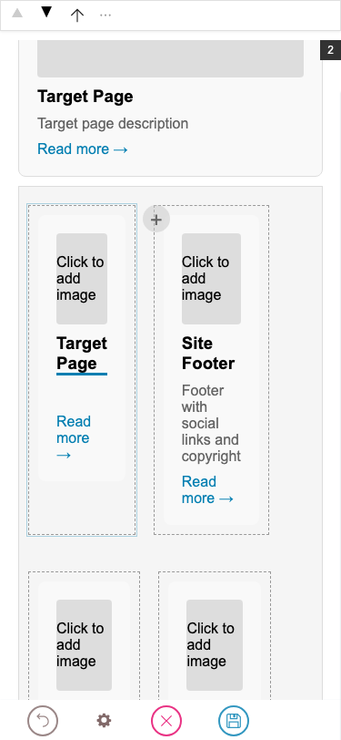
A responsive grid layout container. Each cell is a child block (teaser, slate, image, etc.) rendered inside the grid. This is the built-in Volto grid block (gridBlock).
Context Navigation Block
A vertical navigation list for grouped pages — a left sidebar on desktop and a collapsible disclosure at the top on mobile. Each row is a navItem (hand-added link) and/or a listing (auto-populated from a path query). The active link is detected from the current URL and gets aria-current="page" plus a .current class. Named after Plone's @contextnavigation endpoint, which serves the same purpose.
Hero Block
A full-width hero section with heading, subheading, image, rich text description, and a call-to-action button. Demonstrates multiple field types in a single block: string, textarea, slate, image, and object_browser.