Image
Displays an image with optional alt text and link. Supports the image picker widget for selecting images from the Plone content tree or uploading new ones.
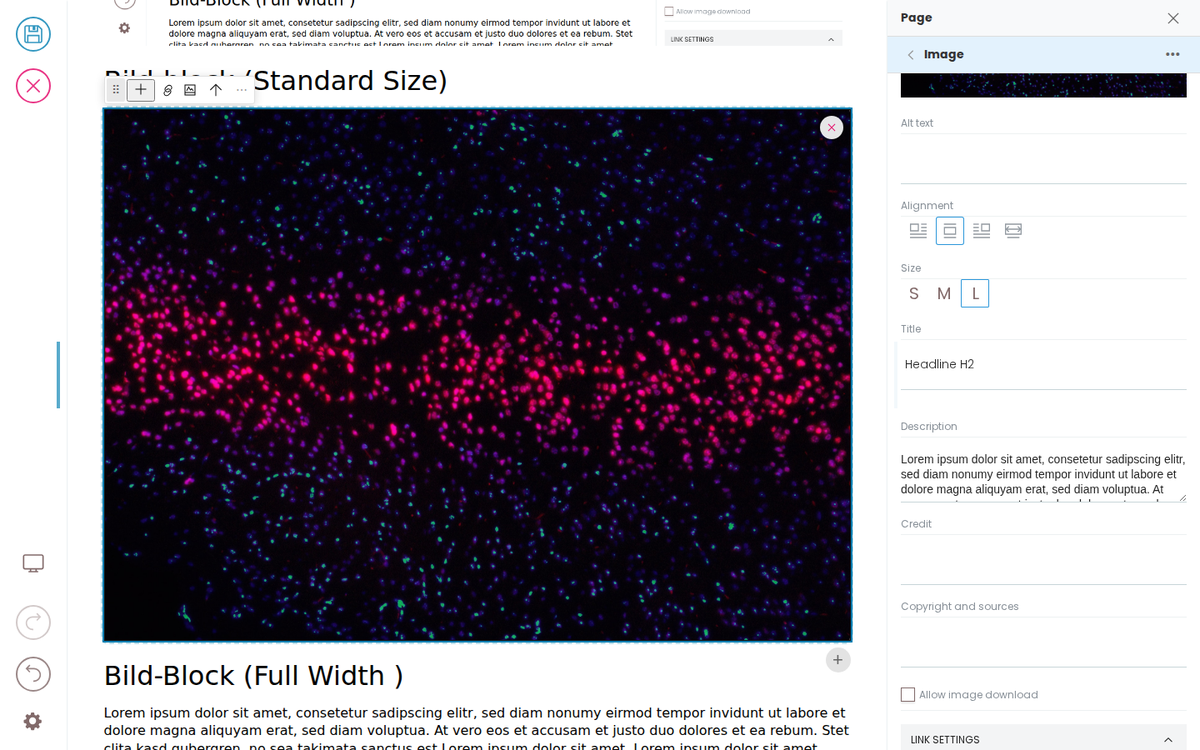
Bild-block (Standard Size)
Bild-Block (Full Width )
Lorem ipsum dolor sit amet, consetetur sadipscing elitr, sed diam nonumy eirmod tempor invidunt ut labore et dolore magna aliquyam erat, sed diam voluptua. At vero eos et accusam et justo duo dolores et ea rebum. Stet clita kasd gubergren, no sea takimata sanctus est Lorem ipsum dolor sit amet. Lorem ipsum dolor sit amet, consetetur sadipscing elitr, sed diam nonumy eirmod tempor invidunt ut labore et dolore magna aliquyam erat, sed diam voluptua. At vero eos et accusam et justo duo dolores et ea rebum. Stet clita kasd gubergren, no sea takimata sanctus est Lorem ipsum dolor sit amet.
Bild-Block (Align: center)
Lorem ipsum dolor sit amet, consetetur sadipscing elitr, sed diam nonumy eirmod tempor invidunt ut labore et dolore magna aliquyam erat, sed diam voluptua. At vero eos et accusam et justo duo dolores et ea rebum. Stet clita kasd gubergren, no sea takimata sanctus est Lorem ipsum dolor sit amet. Lorem ipsum dolor sit amet, consetetur sadipscing elitr, sed diam nonumy eirmod tempor invidunt ut labore et dolore magna aliquyam erat, sed diam voluptua. At vero eos et accusam et justo duo dolores et ea rebum. Stet clita kasd gubergren, no sea takimata sanctus est Lorem ipsum dolor sit amet.
Bild-Block (Align: Left)
The Bild-Block can be aligned to the left with text floating around it on the right side.
Lorem ipsum dolor sit amet, consetetur sadipscing elitr, sed diam nonumy eirmod tempor invidunt ut labore et dolore magna aliquyam erat, sed diam voluptua. At vero eos et accusam et justo duo dolores et ea rebum. Stet clita kasd gubergren, no sea takimata sanctus est Lorem ipsum dolor sit amet.Lorem ipsum dolor sit amet, consetetur sadipscing elitr, sed diam nonumy eirmod tempor invidunt ut labore et dolore magna aliquyam erat, sed diam voluptua. At vero eos et accusam et justo duo dolores et ea rebum. Stet clita kasd gubergren, no sea takimata sanctus est Lorem ipsum dolor sit amet.Lorem ipsum dolor sit amet, consetetur sadipscing elitr, sed diam nonumy eirmod tempor invidunt ut labore et dolore magna aliquyam erat, sed diam voluptua. At vero eos et accusam et justo duo dolores et ea rebum. Stet clita kasd gubergren, no sea takimata sanctus est Lorem ipsum dolor sit amet.Lorem ipsum dolor sit amet, consetetur sadipscing elitr, sed diam nonumy eirmod tempor invidunt ut labore et dolore magna aliquyam erat, sed diam voluptua. At vero eos et accusam et justo duo dolores et ea rebum. Stet clita kasd gubergren, no sea takimata sanctus est Lorem ipsum dolor sit amet.
Bild-Block (Align Right)
The Bild-Block can be aligned to the right with text floating around it on the left side.
Lorem ipsum dolor sit amet, consetetur sadipscing elitr, sed diam nonumy eirmod tempor invidunt ut labore et dolore magna aliquyam erat, sed diam voluptua. At vero eos et accusam et justo duo dolores et ea rebum. Stet clita kasd gubergren, no sea takimata sanctus est Lorem ipsum dolor sit amet. Lorem ipsum dolor sit amet, consetetur sadipscing elitr, sed diam nonumy eirmod tempor invidunt ut labore et dolore magna aliquyam erat, sed diam voluptua. At vero eos et accusam et justo duo dolores et ea rebum.Lorem ipsum dolor sit amet, consetetur sadipscing elitr, sed diam nonumy eirmod tempor invidunt ut labore et dolore magna aliquyam erat, sed diam voluptua. At vero eos et accusam et justo duo dolores et ea rebum. Stet clita kasd gubergren, no sea takimata sanctus est Lorem ipsum dolor sit amet. Lorem ipsum dolor sit amet, consetetur sadipscing elitr, sed diam nonumy eirmod tempor invidunt ut labore et dolore magna aliquyam erat, sed diam voluptua.
Developer Reference
Schema
Pass this object inside the blocks option when calling initBridge() to register this block type with the admin UI. See Custom Blocks for the full setup guide.
    image: {
        id: 'image',
        // The chooser group, stated: a block's group is never made up.
        group: 'common',
        title: 'Image',
        // Mirrors Volto's ImageSchema (core Image/schema.jsx), with two
        // deliberate differences.
        //
        // 1. `url` is declared. Volto leaves it out of `properties` because the
        //    upload widget writes it, not a sidebar field — but hydra reads the
        //    schema to learn that `url` is a MEDIA field, which is what makes
        //    data-edit-media="url" an editable target rather than an unknown
        //    attribute. Undeclared, the image is uneditable on the canvas.
        //
        // 2. `url` is REQUIRED. An image block exists to hold an image, so while
        //    editing an empty one is always shown, like a revealed field: the
        //    bridge seeds the same stand-in the reveal toggle uses, with no
        //    toggle needed, giving the author something to click. The frontend
        //    draws no placeholder of its own (no data ⇒ no element), so a visitor
        //    never sees one; the admin refuses to save it empty anyway. Reveal's
        //    toggle is for OPTIONAL fields that are absent until asked for (a
        //    hero's image).
        //
        // Volto states the rest as a schema FUNCTION of formData (alt/align/size
        // and the link fieldset appear only once a url exists). A function can't
        // cross postMessage to a frontend, so the same rule is expressed as
        // fieldRules, which travels as data.
        blockSchema: {
            fieldsets: [
                { id: 'default', title: 'Default', fields: ['url', 'alt', 'align', 'size', 'title', 'description', 'credit', 'copyright_and_sources', 'allow_image_download'] },
                { id: 'link_settings', title: 'Link settings', fields: ['href', 'openLinkInNewTab'] },
            ],
            properties: {
                title: { title: 'Title' },
                description: { title: 'Description', widget: 'textarea' },
                credit: { title: 'Credit' },
                copyright_and_sources: { title: 'Copyright and sources' },
                allow_image_download: { title: 'Allow image download', type: 'boolean' },
                url: { title: 'Image', widget: 'image', placeholder: 'Browse the site or type a URL' },
                alt: { title: 'Alt text' },
                align: { title: 'Alignment', widget: 'align', default: 'center' },
                size: { title: 'Size', widget: 'image_size', default: 'l' },
                href: {
                    title: 'Link to',
                    widget: 'object_browser',
                    mode: 'link',
                    selectedItemAttrs: ['Title', 'Description', 'hasPreviewImage'],
                    allowExternals: true,
                },
                openLinkInNewTab: { title: 'Open in a new tab', type: 'boolean' },
            },
            required: ['url'],
        },
        schemaEnhancer: {
            fieldRules: {
                alt: { when: { url: { isSet: true } }, else: false },
                align: { when: { url: { isSet: true } }, else: false },
                // Volto's own Image schema drops the size choice for a
                // full-width image: the width IS the page, so there is nothing
                // to choose. Written as a LIST of rules — the first whose
                // condition holds wins, and the bare `false` at the end is the
                // catch-all that hides the field when none does.
                size: [
                  { when: { url: { isSet: true }, align: { isNot: 'full' } } },
                  false,
                ],
                href: { when: { url: { isSet: true } }, else: false },
                openLinkInNewTab: { when: { url: { isSet: true } }, else: false },
            },
        },
        // A frontend's fieldMappings REPLACE the admin's (mergeFrontendBlock),
        // so the admin's conversion from a teaser is listed here too.
        fieldMappings: {
            '@default': { '@id': 'href', 'title': 'alt', 'image': 'url' },
            teaser: { 'href': 'href', 'title': 'alt', 'preview_image': 'url' },
        },
    }
JSON Block Data
Example block JSON (as stored in the CMS). This is the data structure your component will receive in the block prop.
{
  "@type": "image",
  "url": "../images/image-block-edit.png",
  "alt": "The image-block example block being edited in Inka",
  "align": "center",
  "size": "l"
}
Rendering
How this block renders in your frontend. Add its handling to your renderer, or — for list-style blocks — register a fetcher and reuse your list rendering.
import { getImageUrl } from './utils.js';

function ImageBlock({ block }) {
  const src = getImageUrl(block.url);
  const alt = block.alt || '';
  const href = block.href?.[0]?.['@id'] || block.href;

  // No image ⇒ no element. While editing, Inka hands an empty image a
  // stand-in to click; a visitor sees nothing.
  if (!src) return <div data-block-uid={block['@uid']} />;
  const img = <img data-edit-media="url" src={src} alt={alt} />;

  return (
    <div data-block-uid={block['@uid']}>
      {href ? (
        <a href={href} data-edit-link="href">{img}</a>
      ) : (
        <>{img}</>
      )}
    </div>
  );
}